FinOps Inform
FinOps dashboards: a practical guide for engineering and finance
Unlock cost visibility and optimize finance with FinOps dashboards. Discover essential panels and a five-step delivery plan to enhance your strategy.

A production FinOps dashboard gives your team cost visibility, unit economics, allocation by owner, anomaly detection, and governance in a single pane, starting today by enabling daily billing exports and enforcing your tag taxonomy.
Here is what that looks like in practice:
Must-have panels:
- Executive unit economics view (cost per customer, infrastructure cost ratio)
- Finance budget vs actuals with forecast to month-end
- Team and service cost view with owner attribution
- Anomaly feed with threshold alerts and incident links
- Reservation and Savings Plan coverage and utilisation
Five-step delivery plan:
- Instrument billing exports and enforce tags across all cloud accounts
- Ingest and normalise spend data into a central store with consistent currency and discount handling
- Model unit economics by mapping cloud services to business units or product features
- Build audience-specific views for engineers, finance, and executives
- Validate against invoices, pilot with one team, then roll out broadly
Immediate next step: enable daily billing export (AWS Cost and Usage Reports, Azure Cost Management export, or GCP billing export) and run a tag coverage report to identify untagged resources before you write a single query.
Key takeaways
A production FinOps dashboard requires audience-specific views, unit-economics metrics, accurate tag-based allocation, and a validated data pipeline. Without all four, the numbers will not drive decisions.
| Point | Details |
|---|---|
| Instrument billing and tags first | Enable daily billing exports and enforce tag taxonomy before writing any dashboard query. |
| Build three audience views | Separate engineering, finance, and executive views from the same dataset; each answers a different question. |
| Unit economics over raw spend | Track cost per customer or cost per transaction, not just total cloud spend, to show whether economics improve as you scale. |
| Validate against invoices | Reconcile dashboard totals against cloud provider invoices monthly; a tolerance above 1% signals a normalisation problem. |
| Koritsu AI for outcomes-based support | Where internal bandwidth is limited, Koritsu AI’s success-fee model delivers verified savings with no upfront cost. |
Why FinOps dashboards matter differently for each audience
The most common mistake is building one dashboard and expecting three audiences to use it. Engineers, finance leads, and executives each come to a cost dashboard with a fundamentally different question, and a single view that tries to answer all three tends to answer none of them well. Audience-specific dashboard design is the single biggest lever for adoption.
- Engineers ask: “Did my last deployment cause a cost regression? Is there an anomaly in my service right now?” They need near-real-time data, service-level granularity, and direct links to the resource or pull request responsible.
- Finance leads ask: “Are we on budget? What is the forecast to month-end? Which team or cost centre is over-running?” They need weekly actuals, chargeback accuracy, and a clean budget vs actuals view tied to their chart of accounts.
- Executives ask: “What is our infrastructure cost as a percentage of revenue? Are unit economics improving as we scale?” They need a single-page summary with trend lines, not raw spend tables.
The adoption principle that works in practice: keep each audience view to six to eight panels maximum, assign a named owner to each view, and schedule a weekly digest to the relevant distribution list. A dashboard nobody opens is not a dashboard, it is a liability.
Pro Tip: Set up scheduled email digests for the finance and executive views on Monday morning, before the weekly planning meeting. Engineers benefit more from Slack or Teams alerts triggered by anomaly thresholds than from scheduled reports.
What metrics should your FinOps dashboard track?
Metrics are where most implementations go wrong. Teams instrument what is easy to pull from the billing API rather than what answers a business question. The table below maps each metric to its calculation and the question it resolves.
| Metric | Definition | How to calculate | Business question answered |
|---|---|---|---|
| Cost per unit | Cloud spend attributable to one business unit (customer, transaction, API call) | Total allocated cloud spend ÷ unit volume for the period | Are we spending more or less per customer as we grow? |
| Infrastructure cost ratio | Cloud spend as a percentage of revenue | Total cloud spend ÷ total revenue | Is cloud cost scaling proportionally with the business? |
| Cloud Efficiency Rate | Ratio of used capacity to provisioned capacity | Used resource hours ÷ provisioned resource hours | How much of what we pay for are we actually using? |
| Untagged spend | Spend on resources with missing or non-compliant tags | Sum of spend where required tags are null or invalid | Can we allocate all spend to an owner or cost centre? |
| Forecasted month-end | Projected total spend for the current month | Current month spend to date ÷ elapsed days × days in month (adjusted for known commitments) | Will we hit or breach budget this month? |
| RI/SP coverage | Percentage of eligible compute covered by Reserved Instances or Savings Plans | Covered usage hours ÷ total eligible usage hours | Are we maximising our commitment discounts? |
| RI/SP utilisation | Percentage of purchased commitment actually consumed | Consumed commitment hours ÷ purchased commitment hours | Are our existing commitments being fully used? |
| Anomaly count | Number of spend spikes exceeding a defined threshold in the period | Count of daily cost deltas exceeding ±N% of the rolling 14-day average | Are there unexpected cost events we need to investigate? |
| FinOps score | Composite measure of tagging health, coverage, utilisation, and forecast accuracy | Weighted average of sub-scores across tag coverage, RI utilisation, and forecast delta | How mature is our cloud financial management overall? |
Two worked examples clarify the most-asked calculations.
Cost per customer: if your total allocated cloud spend for March is £120,000 and you served 4,000 active customers, your cost per customer is £30.
Forecast delta: if you are on day 15 of a 31-day month and have spent £60,000, your simple run-rate forecast is £124,000. If your budget is £110,000, the delta is £14,000 over. That number belongs on the finance view with a drill-down to the services driving the overage.
Cloud unit economics from the FinOps Foundation frames this precisely: the goal is not to minimise absolute spend but to maximise gross profit per unit. That reframe changes which metrics you prioritise.
Pro Tip: Shared infrastructure (networking, logging, security tooling) is the hardest cost to allocate. Agree a fixed overhead percentage with finance, typically based on prior-period actuals, and apply it as a surcharge to each team’s direct spend. Revisit the percentage quarterly rather than trying to attribute every byte of shared traffic.
What views and features should every FinOps dashboard include?
Metrics without structure are just numbers. The panels below translate the metrics table into concrete dashboard pages, with a brief wireframe note for each audience.
Executive summary page (4–6 panels)
- Infrastructure cost ratio trend (line chart, 12-month rolling)
- Cost per unit trend vs target (line chart with threshold line)
- Top 5 cost-driving services (bar chart)
- Forecast vs budget for the current month (gauge or KPI card)
- RI/SP coverage percentage (KPI card)
Finance page (6–8 panels)
- Budget vs actuals by cost centre (table with variance column)
- Month-end forecast with confidence interval
- Chargeback or showback report by team
- Untagged spend trend (line chart)
- Top cost anomalies for the period (table with links)
- Commitment purchase recommendations (table)
Engineering and team view (6–8 panels)
- Service-level cost by owner (table, daily refresh)
- Cost regression detector (delta from prior day/week, colour-coded)
- Anomaly feed with severity, service, and incident link
- Rightsizing opportunities (table: resource ID, current cost, recommended action, estimated saving)
- Tag compliance by team (percentage bar)
- Reservation utilisation for team-owned resources
Anomaly and incident feed This page deserves its own section in the navigation. Surface every alert with a timestamp, affected service, cost delta, and a link to the relevant runbook or incident ticket. Without that link, engineers treat the alert as noise. You can read more about handling surprise cost anomalies and how to structure the incident response workflow.
UX features that drive adoption:
- Owner links on every resource row (links to team Slack channel or Jira board)
- Annotation layer so teams can mark variance reasons (deployment, traffic spike, new feature)
- Refresh rate indicator on each panel (so users know how fresh the data is)
- Role-based access control so engineers see only their team’s data by default
- Scheduled report delivery via email or Slack
Pro Tip: Limit each audience page to eight panels. Beyond that, users stop reading and the dashboard becomes a reporting artefact rather than a decision tool. If a metric matters, it gets a panel; if it does not drive a decision, it belongs in a drill-down, not on the main view.
What data and prerequisites do you need before building?
The dashboard is only as trustworthy as the data feeding it. Get these foundations right before writing a single query.
Required data sources:
- AWS Cost and Usage Reports (CUR), hourly or daily granularity, resource-level detail
- Azure Cost Management export, daily export to storage account, amortised cost view
- GCP billing export to BigQuery, standard or detailed usage export
- Cloud provider APIs, for resource metadata, tag state, and commitment inventory
- Application telemetry, request counts, active users, transaction volumes for unit mapping
- Contract and invoice files, for discount mapping, EDP/MACC reconciliation, and VAT handling
Tagging prerequisites:
- Define a tag taxonomy before you build: at minimum,
owner,team,environment,cost-centre, andproducttags - Enforce tags at resource creation using AWS Service Control Policies, Azure Policy, or GCP Organisation Policies
- Map tag values to your chart of accounts so finance can reconcile without manual intervention
- Agree a convention for shared resources (e.g.
team: shared-infra) so they are not silently unallocated
Ingestion and normalisation steps:
- Run ETL on a daily cadence at minimum; hourly for anomaly detection use cases
- Normalise all spend to GBP at the daily exchange rate published by the Bank of England (or lock to a monthly rate agreed with finance)
- Apply Reserved Instance amortisation so upfront fees spread across the commitment period rather than appearing as a spike on day one
- Map discount tiers and enterprise agreement credits before computing actuals
| Data source | Expected format | Realistic update frequency |
|---|---|---|
| AWS Cost and Usage Reports | Parquet or CSV in S3 | Daily (previous day, ~8 hours lag) |
| Azure Cost Management export | CSV in Azure Blob Storage | Daily (previous day, up to 24-hour lag) |
| GCP billing export | BigQuery table | Daily (previous day, up to 24-hour lag) |
| Cloud provider APIs (resource metadata) | JSON via REST | Near-real-time (minutes) |
| Application telemetry | Time-series DB or data warehouse | Near-real-time to hourly |
| Invoice and contract files | PDF or CSV | Monthly |
Microsoft’s guidance on unit economics implementation recommends automating unit-cost calculations as FinOps maturity grows, which means your ingestion pipeline needs to carry both spend and telemetry in the same store from day one.
How to build, validate and roll out a FinOps dashboard
A staged build reduces the risk of shipping a dashboard that finance cannot reconcile and engineers do not trust. Follow this sequence.
- Enable billing exports on all cloud accounts. Confirm data is landing in your central store (S3, Blob Storage, or BigQuery) and that resource-level detail is switched on.
- Land raw data in a central analytical store. Options include Azure Data Explorer, BigQuery, Redshift, or a data lakehouse. Partition by date and cloud provider.
- Normalise and enrich. Apply currency conversion, RI amortisation, discount mapping, and tag enrichment. Compute a
cost_centrefield by joining tag values to your chart of accounts. - Compute allocations. Split shared infrastructure using your agreed overhead model. Generate team-level and service-level cost tables.
- Build audience views. Start with the engineering view, it has the fewest dependencies and the fastest feedback loop. Add the finance view next, then the executive summary.
- Run validation tests. Compare your dashboard total for the prior month against the cloud provider invoice. A reconciliation tolerance of less than 1% is a reasonable acceptance criterion. Check that tag coverage is above your agreed threshold (80% is a common starting point). Verify that unit-cost figures pass a sanity check against prior-period actuals.
- Pilot with one product team. Give them access, walk through the panels in a 30-minute session, and collect feedback over two weeks. Track whether they open the dashboard without being prompted.
- Broader rollout. Onboard finance and executive stakeholders. Set up scheduled digests. Document the runbook for anomaly response.
Validation checklist before go-live:
- Invoice reconciliation within 1% tolerance for the prior month
- Tag coverage above agreed threshold across all accounts
- Unit-cost figures within 10% of prior-period manual calculation
- Access control verified (engineers see team scope, finance sees org-wide, executives see summary only)
- Alerting configured for data pipeline failures and anomaly thresholds
- Data retention policy set (typically 13 months for year-on-year comparison)
- Runbook written for anomaly investigation and escalation
For a detailed cloud cost dashboard build guide, including schema examples and validation scripts, the Koritsu blog covers the implementation steps in depth.
Which tools and templates can you deploy immediately?
You do not need to build from scratch. Several deployable templates and open-source projects give you a working starting point within hours.
Azure Data Explorer FinOps hub templates
Microsoft provides pre-built Azure Data Explorer dashboard templates for organisations running Azure FinOps hubs. The templates include deployment scripts, pre-configured queries, and visualisations for cost allocation, commitment coverage, and anomaly detection. Prerequisites include an Azure Data Explorer cluster, a FinOps hub deployment, and appropriate RBAC permissions. This is the lowest-friction starting point for Azure-primary environments and is well-suited to UK enterprises already using the Microsoft stack.
Grafana and OpenCost
The open-source multicloud FinOps AI dashboard project combines Grafana with OpenCost to consolidate AWS, Azure, and GCP billing into a single view, with planned LLM-driven recommendation features. OpenCost provides Kubernetes-level cost allocation, which makes this combination particularly useful for engineering teams running containerised workloads. Grafana’s alerting engine handles anomaly notifications natively. The trade-off: you own the operational burden of the pipeline and the Grafana instance.
Azure FinOps dashboard (Python, PostgreSQL, Grafana)
For multi-subscription Azure environments, the Azure FinOps Dashboard repository provides a Python-based collector, a PostgreSQL store, Grafana dashboard JSON exports, and CI/CD workflows using GitHub Actions with Slack alerting. This is a production-grade reference for teams that want full control over the stack and need CI for dashboard provisioning.
AWS FinOps dashboard with QuickSight
The AWS multicloud QuickSight example documents an architecture using AWS Glue for ETL, Athena for querying, and QuickSight for visualisation. It is a viable path for AWS-primary organisations seeking a low-cost, flexible solution, but it requires operational ownership of the ETL pipeline and ongoing maintenance discipline.
Power BI community dashboards
The AWS cloud cost optimisation Power BI repository demonstrates DAX measures for custom KPI engineering, rightsizing insights, tagging health panels, and a multi-page layout covering executive summary and optimisation insights. Power BI integrates naturally with Microsoft Fabric and Azure Cost Management exports, making it a strong choice for finance-oriented views in UK organisations already using the Microsoft 365 stack.
UK-specific notes: Store invoice artefacts (PDF invoices, credit notes, enterprise agreement documents) in a UK-region storage account or bucket to satisfy data residency requirements. Handle VAT separately from net cloud spend in your normalisation layer, your finance team needs net figures for P&L, but VAT-inclusive figures for reconciliation against supplier invoices. For organisations using big data analytics at scale, specialist big data dashboard services can accelerate the design of high-volume analytical views.
How do you measure whether your dashboard is actually working?
A dashboard that nobody acts on is a cost, not an asset. Track these success measures from week one.
Key success metrics:
- Dashboard open rate (weekly active users ÷ total invited users)
- Scheduled digest delivery rate (digests sent and opened vs total sent)
- Mean time to resolution for cost incidents surfaced by the anomaly feed
- Forecast accuracy (forecast vs actuals at month-end, expressed as percentage variance)
- Tag coverage trend (percentage of spend with compliant tags, week on week)
- Chargeback accuracy (finance sign-off rate on monthly allocation reports)
| Metric | Target | Owner |
|---|---|---|
| Dashboard weekly active users | a majority of invited users | FinOps lead |
| Forecast accuracy (month-end) | Within 5% of actuals | Finance lead |
| Tag coverage | >80% of total spend | Engineering lead |
| Mean time to resolve cost incident | <48 hours | Engineering lead |
| Chargeback sign-off rate | monthly | Finance lead |
Governance controls:
- Assign a named owner to each dashboard view. Without ownership, views go stale.
- Release cadence: treat dashboard updates like software releases. Version the dashboard JSON, review changes in a pull request, and deploy via CI.
- Access control audit: review permissions quarterly. Leavers should lose access automatically via your identity provider.
- Reconciliation test: run the invoice reconciliation check monthly and log the result. If tolerance drifts above 2%, investigate before the next billing cycle closes.
Pro Tip: Embed the engineering dashboard review into your existing sprint retrospective or weekly platform meeting. Five minutes on “what did the cost anomaly feed surface this week?” is more effective than a separate FinOps meeting that competes for calendar space.
Unit economics, refresh cadence and practical trade-offs
Cloud unit economics is the process of translating cloud spend into a cost per meaningful business output, a customer served, a transaction processed, an API call fulfilled. The FinOps Foundation frames it as the common language between engineering and finance: rather than debating whether £200,000 of cloud spend is too much, you ask whether £0.008 per API call is improving or degrading as volume grows.
A worked example for a UK SaaS business: your data processing pipeline runs on AWS and costs £18,000 per month. Your platform processes 6 million transactions per month. Cost per transaction is £0.003. If next month you process 7 million transactions and spend £19,800, your cost per transaction has dropped to £0.00283, unit economics improved despite absolute spend rising. That is the signal your executive dashboard should surface, not the raw £1,800 increase.

Microsoft’s unit economics guidance recommends automating unit-cost recomputation as part of your ETL pipeline rather than calculating it manually each month. The datasets you need: billing line items, resource tags mapping services to products, and application telemetry carrying unit volume.
Recommended refresh cadences by audience:
- Engineers: near-real-time to daily. Cost regressions and anomalies need to surface within hours of a deployment, not a week later.
- Finance: weekly for actuals, monthly for chargeback and allocation reports. Daily data is noise for budget tracking; weekly smooths out day-of-week patterns.
- Executives: weekly summary, monthly deep-dive. A daily executive view encourages micro-management of spend rather than strategic decision-making.
Audience-specific refresh cadences are a practitioner consensus, not just a UX preference. Engineering dashboards that refresh daily and finance dashboards that refresh weekly serve their audiences better than a single pipeline trying to satisfy both at once.
Common trade-offs:
- Accuracy vs latency: near-real-time data from cloud APIs is less accurate than the finalised billing export (which arrives 24–48 hours later). For anomaly detection, accept the approximation. For chargeback, wait for the finalised export.
- Allocation complexity vs business value: a perfect allocation model that takes three months to build delivers less value than an 80% accurate model shipped in three weeks. Start with direct spend allocation and add shared overhead later.
- Granularity vs performance: resource-level queries on 12 months of CUR data are slow. Pre-aggregate to daily and weekly summaries for the dashboard layer; keep raw data for ad-hoc investigation.
Pro Tip: Automate unit-cost recomputation by joining your billing table to your telemetry table on a daily schedule. Store the result as a pre-computed unit_cost_daily table. Dashboard queries hit the pre-computed table, not the raw billing data, which keeps load times under two seconds even at enterprise scale.
UK regulatory compliance and data privacy for FinOps dashboards
Cloud billing data contains commercially sensitive information: supplier contract terms, spend by business unit, and in some cases personal data if resource tags include employee identifiers. UK organisations must handle this data in line with the UK GDPR and the Data Protection Act 2018.
Store billing exports and invoice artefacts in UK-region cloud storage. AWS, Azure, and GCP all offer UK-region options (AWS eu-west-2, Azure UK South, GCP europe-west2). Avoid routing billing data through US-region buckets by default, many cloud accounts default to us-east-1 for Cost and Usage Report delivery unless explicitly configured otherwise.
Apply role-based access control to dashboard data. Engineers should see their team’s spend; they should not see salary-linked cost centre codes or contract pricing. Finance leads need org-wide spend but not individual resource-level detail by default. Document your access control model in a data processing record as required under UK GDPR Article 30.
If your dashboard ingests application telemetry that could identify individual users (session counts, user IDs), anonymise or pseudonymise at the ingestion layer before joining to billing data. The Information Commissioner’s Office (ICO) guidance on data minimisation applies: collect only what you need for the cost allocation purpose.
For organisations subject to FCA oversight or operating in regulated sectors, retain billing and allocation records for the period required by your sector’s rules, and ensure your audit trail covers who accessed the dashboard and when.
Aligning your dashboard to UK budgeting and forecasting practices
UK finance teams work to a financial year that typically runs April to March, not the calendar year used by most cloud provider billing consoles. Your dashboard needs to support both views: a rolling 12-month view for cloud cost trend analysis, and an April-to-March view for budget vs actuals reporting aligned to your statutory accounts.
Build your date dimension table with both a calendar month and a financial year field. This lets finance filter to their year-end without requiring a separate dataset.
Currency handling matters more than most teams expect. Cloud providers bill in USD by default. Your dashboard should convert to GBP at the daily exchange rate published by the Bank of England, or at a fixed monthly rate agreed with your finance director. Locking to a monthly rate is simpler for budget reconciliation, it means the variance between budget and actuals reflects actual consumption changes, not currency fluctuation. Store both the USD source figure and the GBP converted figure in your billing table so finance can reconcile against the supplier invoice (which will be in USD) and against the P&L (which will be in GBP).
Your dashboard should show net-of-VAT figures for P&L purposes. Confirm the VAT treatment with your tax adviser, particularly if your organisation has partial exemption status.
For forecasting, align your model to the budget cycle. Most UK finance teams set annual budgets in Q3 of the prior financial year (October to December). Your dashboard’s forecast-to-month-end and forecast-to-year-end figures should feed into that process, not run in parallel to it.
Cloud provider features and tooling preferred in the UK market
UK enterprises tend to run on Azure or AWS as their primary cloud, with GCP more common in data-intensive or analytics-heavy workloads. The Microsoft stack (Azure, Power BI, Microsoft Fabric) has strong penetration in UK enterprise, which means Azure Cost Management, Azure Data Explorer, and Power BI are frequently the path of least resistance for FinOps reporting.
Azure Cost Management’s native export to storage, combined with Microsoft Fabric or Power BI, gives finance teams a familiar interface without requiring a separate BI tool licence. The Azure Data Explorer FinOps hub templates are particularly well-suited to this environment.
For AWS-primary organisations, AWS Cost Explorer provides a serviceable starting point for ad-hoc analysis, but its export capabilities (via Cost and Usage Reports) are what matter for a production dashboard. AWS Cost Explorer’s native UI is not a substitute for a purpose-built dashboard: it lacks allocation models, custom unit economics, and scheduled distribution.
GCP organisations benefit from the BigQuery billing export, which is the most query-friendly of the three native exports. Looker Studio (formerly Data Studio) integrates directly with BigQuery and can serve as a lightweight dashboard layer for smaller teams before they invest in a full BI platform.
For teams that need a lightweight prototype before committing to a full BI stack, Excel-based visual dashboards can serve as a rapid KPI layout tool during the design phase, particularly useful for aligning with finance stakeholders on what they actually want to see before engineering builds the production version.
Handling multi-cloud and hybrid-cloud environments
Most UK enterprises of any scale run more than one cloud provider, and many retain on-premises infrastructure alongside public cloud. A FinOps dashboard that covers only one provider gives an incomplete picture and can actively mislead budget decisions.
The core challenge is normalisation. Each provider uses different billing granularities, different discount models, and different resource taxonomies. AWS bills by the hour for EC2; Azure bills by the minute for VMs; GCP uses per-second billing for Compute Engine. Your normalisation layer must convert all three to a common unit (daily cost per resource) before any cross-cloud comparison is meaningful.
For hybrid environments, on-premises costs are typically captured via a fixed monthly allocation from your finance system rather than a real-time API. Include a manual upload mechanism in your ingestion pipeline so finance can add on-premises cost centre allocations to the dashboard alongside cloud spend. This gives executives a true total infrastructure cost view.
The AWS QuickSight multicloud architecture demonstrates one approach: use a cloud-native ETL layer (Glue) to ingest billing data from multiple providers into a common schema, then query with Athena and visualise with QuickSight. The Grafana and OpenCost combination offers a similar pattern for Kubernetes-heavy environments spanning multiple clouds.
Tag consistency across clouds is the hardest operational problem. AWS, Azure, and GCP each have different tag key formats and character limits. Define your tag taxonomy in a provider-agnostic format and map it to each provider’s conventions in your normalisation layer. A resource tagged team: payments in AWS and Team: Payments in Azure should resolve to the same owner in your dashboard.
Change management and adoption for UK FinOps teams
A technically excellent dashboard that engineering teams ignore and finance teams distrust has delivered no value. Change management is not a soft add-on, it is the difference between a dashboard that drives cost reduction and one that sits in a bookmark folder.

Start with a named FinOps champion in each team. This person does not need to be a FinOps specialist; they need to care about the numbers and have enough credibility to translate dashboard findings into engineering decisions. In UK organisations, this role often sits with a senior engineer or a platform lead rather than a dedicated FinOps hire.
Run a structured pilot before broad rollout. Choose a product team with a clear cost problem, ideally one where the engineering lead already suspects overspend in a specific service. Give them access to the engineering view, walk through the panels in a single session, and ask them to bring one finding to their next sprint planning. That concrete outcome is your proof of concept for the broader rollout.
Communicate the “why” in terms that resonate with each audience. Engineers respond to “this will help you catch cost regressions before they hit the monthly bill.” Finance leads respond to “this replaces the manual spreadsheet reconciliation you do every month-end.” Executives respond to “this gives you a single number for infrastructure cost as a percentage of revenue, updated weekly.”
For automated cost alerts, embedding threshold notifications into the channels teams already use (Slack, Teams, email) is consistently more effective than asking people to log into a separate tool.
What a successful FinOps dashboard rollout actually looks like
The rollouts that work share a pattern: they start narrow, prove value fast, and expand from there. The ones that fail try to build the perfect dashboard for every audience simultaneously and ship nothing for six months.
A realistic timeline for a mid-market UK organisation:
- Weeks 1–2: Enable billing exports, land raw data, run a tag coverage report. You will almost certainly find that 30–50% of spend is untagged. That finding alone justifies the project.
- Weeks 3–4: Build the engineering view. Focus on service-level cost, daily delta, and the anomaly feed. Pilot with one team. Expect two or three iterations on the panel layout based on their feedback.
- Weeks 5–6: Build the finance view. This takes longer because of allocation complexity and the need to reconcile against the prior month’s invoice. Finance dashboards typically take 4–8 weeks to reach production quality, compared with 1–2 weeks for the engineering view.
- Weeks 7–8: Build the executive summary. This is the simplest view to build but the hardest to get right in terms of metric selection. Run it past the CFO or CTO before publishing.
Stakeholder management note: finance leads will ask about reconciliation accuracy before they trust the dashboard. Run the invoice reconciliation check in week 5 and share the result with them directly.
The pilot team’s first finding, a service running at three times its expected cost because a developer left a load test environment running, is the kind of outcome that secures budget for the broader rollout. Pick a pilot team where that kind of discovery is plausible.
When does an outcomes-based FinOps service make sense?
Building and maintaining a production FinOps dashboard is not a one-time project. The pipeline needs operational ownership, the metrics need quarterly review, and the allocation model needs updating every time your product structure changes. For many UK engineering teams, that ongoing burden competes directly with product delivery.
There are specific situations where engaging an outcomes-based FinOps service accelerates results significantly: limited internal FinOps bandwidth, complex multi-cloud chargeback requirements, weak tagging coverage that needs remediation before the dashboard is trustworthy, or a multi-cloud rollout where normalisation complexity is high.
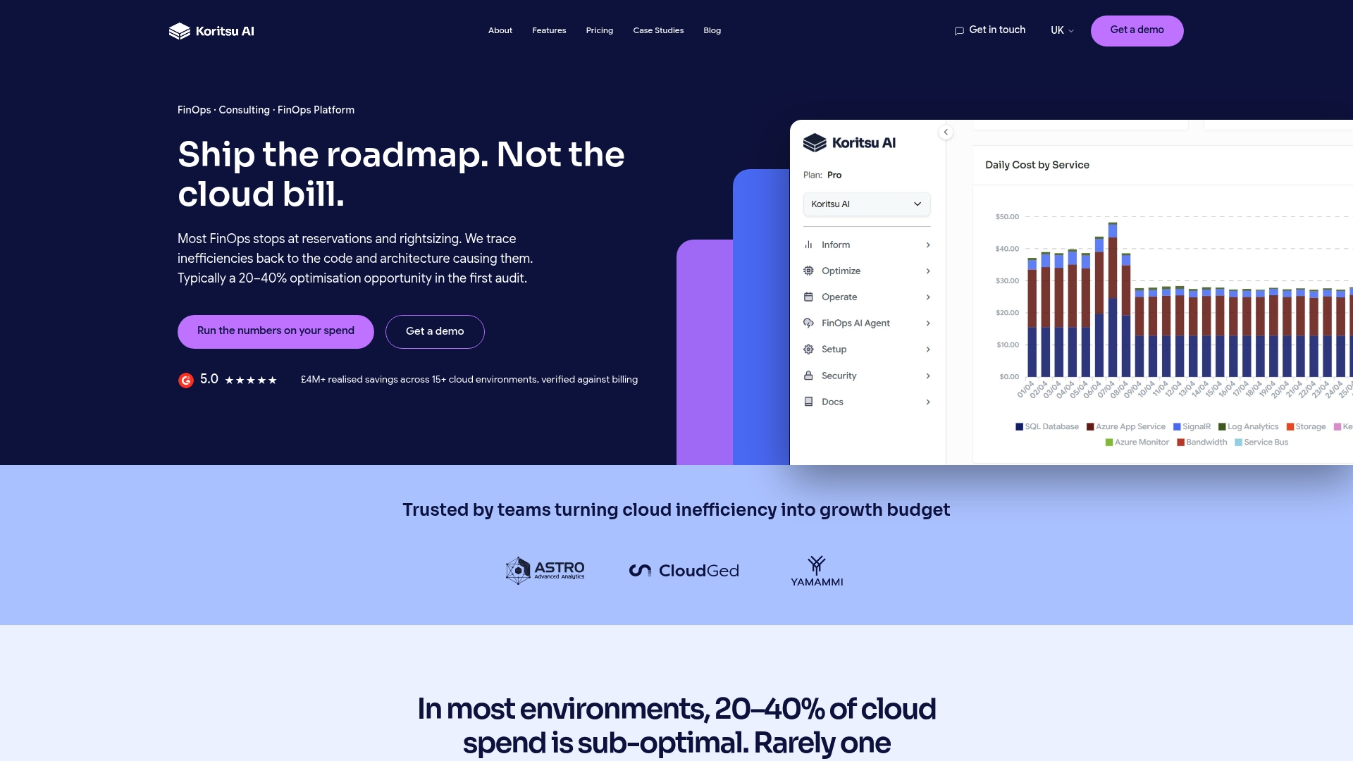
Koritsu AI combines a continuously monitoring AI platform with hands-on expert support. Kori, the AI agent, surfaces where money is being lost across your AWS, Azure, or GCP environment. The specialists help your engineering team act on those findings, not just report them. The engagement model is outcomes-based: Koritsu AI takes a share of the savings actually realised, so there is no upfront risk. A UK bidding platform reduced cloud costs by 52% through this model, with savings verified against billing data.
If your team is ready to move from a static cost report to a live, allocation-accurate FinOps dashboard with expert support, start with a free assessment at Koritsu.
Sources
- Introduction to Cloud Unit Economics
- Unit economics - Cloud Computing | Microsoft Learn
- FinOps Dashboard Examples: What Good Looks Like (2026) | FinOpsForge
- Create a multicloud FinOps dashboard with Amazon QuickSight using AWS services | AWS Public Sector Blog