FinOps Inform
Engineering Grade Cloud Cost Reporting: Start With Canonical Exports
Engineering grade FinOps for cloud cost reporting. Enable native billing exports, build one canonical dataset, and turn dashboards into verified savings.

Cloud cost reporting should give you one source of truth: a queryable export of your billing data that feeds dashboards, alerts, and action. The immediate step, if you have not taken it, is enabling native billing export, whether that is AWS CUR to S3 or Google Cloud billing export to BigQuery, and mapping it to a schema like FOCUS. Everything else, including dashboards and anomaly alerts, depends on getting this plumbing right first.
TL;DR:
- Proper cloud cost reporting requires enabling native billing exports and ensuring data lands in a queryable format like S3, BigQuery, or storage accounts, with a schema reference to avoid silent failures.
- Ingested data should be stored in a partitioned, clustered, and idempotent structure to support fast, cost-effective queries and maintain one canonical dataset across the organisation.
- Dashboards should focus on spend trends, top drivers, and anomalies, with views tailored for different audiences such as executives, engineers, and finance teams.
- Accurate cost attribution depends on enforced tagging policies, automated tag propagation, and clear allocation rules for shared infrastructure, with regular reconciliation against actual bills.
- Reporting cadence should be daily for raw data, weekly for operational reviews, and monthly for reconciled reports, with anomaly detection based on recent history and service-specific thresholds.
Where does cloud cost reporting data actually come from?
Every serious reporting setup starts with native billing export, not console screenshots. Each provider ships this differently, and the differences matter when you are building pipelines.
AWS Cost and Usage Reports (CUR) deliver line item data to an S3 bucket as CSV files with a manifest, refreshed up to three times daily. CUR is resource level, so you get granularity down to individual instances and tags, which console reports like Cost Explorer cannot match for reconciliation work.
Google Cloud billing export to BigQuery streams detailed usage data throughout the day, and Google now offers a FOCUS export option that normalises the dataset into a standard schema. This matters if you run multi-cloud, since FOCUS removes a lot of the translation work between providers. Our own walkthrough on GCP billing export covers the configuration traps teams hit before the two year retention window forces a rebuild.
Azure offers a comparable pattern through Cost Management exports to a storage account, generally on a daily schedule, with usage detail broken out by resource. Other providers, including Oracle Cloud, publish similar CSV export mechanisms, so the pattern of scheduled export plus a queryable store is now close to universal.
Before you build anything on top, check these:
- Export is enabled at the organisation or billing account level, not per project
- Granularity includes resource IDs and tags, not just service totals
- Delivery lands somewhere queryable (S3, BigQuery, or a storage account you can point Athena or Synapse at)
- You have a manifest or schema reference so downstream tooling does not break silently
How should you ingest and store billing data for analysis?
Raw exports are not reports. You need a store that supports fast, cheap queries at the volume billing data generates, which can run into millions of rows a month for a mid-sized estate.

On AWS, the standard pattern is CUR landing in S3, queried through Athena for ad hoc work or loaded into Redshift when query volume justifies a warehouse. On GCP, BigQuery is both the landing zone and the query engine, which simplifies the stack but means query costs need managing directly, since scanning large tables repeatedly gets expensive fast.
Partitioning by billing date and clustering by service or account cuts query costs significantly and speeds up the reports people actually run daily. Design for one canonical dataset per organisation, not one per team, and make loads idempotent so a retry never double counts a day's spend, a mistake that quietly wrecks trust in the numbers.
- Partition by usage date; cluster by service, account, or project
- Load incrementally, and make reloads idempotent
- Keep one canonical table others query from, rather than forked copies
- Adopt FOCUS or an equivalent consistent schema if you operate across more than one provider
Pro Tip: Tag your canonical dataset with a schema version column from day one. When you migrate to FOCUS or add a new provider, you will need to distinguish old rows from new without rerunning the whole history.
What should a cloud cost dashboard actually show?
Good dashboards answer three questions fast: what changed, who owns it, and what to do next. Vanity charts that just show total spend rising left to right waste screen space finance and engineering could use for decisions.
- Spend trend with a rolling comparison against the prior period, so a jump is obvious without mental arithmetic
- Top cost drivers, ranked by absolute change rather than percentage, since a 200% jump on a £10 resource matters less than a 5% jump on a £50,000 one
- Cost by team or service, structured for showback (informational, no billing) or chargeback (actually billed back), depending on how mature your allocation model is
- Top anomalous resources, surfaced automatically rather than buried in a filterable table nobody opens
Grafana's community cloud cost templates are a reasonable starting point for these panels, and Datadog's cost dashboards demonstrate the same pattern for teams already using it for observability, pairing cost widgets with the metrics that explain the spend. Our guide to structuring FinOps dashboards goes deeper on tailoring views by audience.
Executives want the trend and the top five drivers, nothing more. Engineering wants the anomaly list and drill down by resource. Finance wants scheduled exports, PDF or CSV, tied to the monthly reconciled bill, because live dashboards are for investigation, not for the numbers that go into a budget review.
How do you allocate and attribute cloud costs accurately?
Reports are only as good as the tags behind them. A tagging policy that exists on paper but is not enforced in CI/CD produces reports that are wrong for whole categories of spend, usually the shared services nobody wants to own.
- Define a mandatory tag set (team, service, environment, cost centre) and fail builds that skip it
- Automate tag propagation through infrastructure-as-code, so tagging is not a manual, forgettable step
- Track cost unit metrics that mean something to engineers: cost per invocation, cost per tenant, cost per feature
- Set explicit allocation rules for shared infrastructure, whether that is apportioning by usage, a fixed percentage, or an agreed business rule, and reconcile monthly against the actual bill
Our practical examples of cost attribution methods and the microservices attribution guide walk through how this looks for teams running dozens of services with genuinely shared dependencies. Aligning to FOCUS, the FinOps community's open schema, keeps these categories comparable if you add a second cloud provider later, rather than rebuilding your allocation logic from scratch.
How often should you report cloud costs, and how do you catch anomalies?
Cadence should match decision speed, not calendar convenience.
- Daily raw exports feed the canonical dataset, no exceptions, since a gap here breaks every downstream report
- Weekly operational reviews catch drift early, before a misconfigured autoscaling group turns into a five figure surprise
- Monthly reconciled reports match the actual invoice, closing the loop between forecast and realised spend
Anomaly detection works best with baseline modelling against recent history rather than fixed thresholds, which either miss slow creep or trigger constantly on normal variance. Route flagged anomalies into a triage workflow with a named owner, an investigation step, and a verification check against the next bill, or the report becomes noise nobody acts on.
Pro Tip: Tune anomaly thresholds by service category, not globally. A 10% swing on a database bill and a 10% swing on a data transfer line item mean very different things.
How does an engineering-grade approach turn reports into verified savings?
A dashboard tells you spend moved. It rarely tells you why, or what to do about it, which is where most FinOps reporting stalls. Some approaches pair continuous analysis with specialist review to close that gap: an AI agent surfaces patterns in billing data, and a specialist confirms the root cause before changes are made.
The workflow runs continuous analysis, then specialist review, then prioritised remediation, then verification against the actual bill, so a claimed saving is a confirmed one.
Findings that show up repeatedly once you look at resource-level data include:
- Invocation patterns in serverless functions running far more often than the workload requires
- Idle resources left provisioned after a migration or a test environment nobody decommissioned
- Shared services misallocated to the wrong team, inflating one group's reported spend and understating another's
When evaluating any partner for this kind of work, ask for sample outputs, a clear verification method against the bill, and a transparent pricing model tied to what they actually find.
Where teams commonly fail, and what to prioritise
Most reporting programmes fail quietly: a snapshot report nobody refreshes, tags applied inconsistently, or forecast numbers presented as if they were realised spend. The fix is sequence, not tooling. Enable exports first, build one canonical dataset second, layer dashboards third, automate alerts fourth, and verify every claimed saving against the actual bill last.
How Koritsu AI turns your cost reports into realised savings
Most FinOps tools stop at the dashboard. Koritsu AI is built for the step after reports: turning what reports reveal into savings finance teams can actually see reflected on the invoice. Where a dashboard tells you spend moved, our platform, paired with hands-on specialist review, tells you why and fixes it.
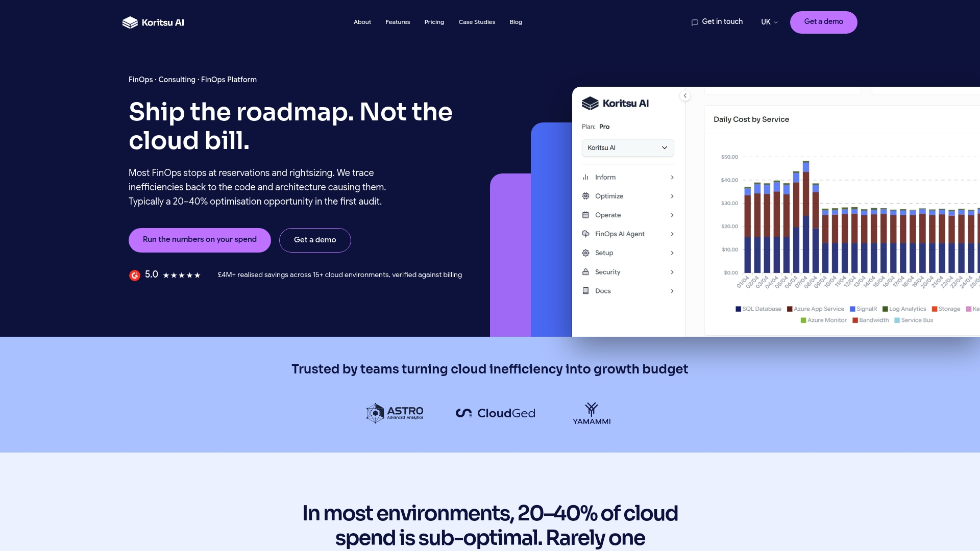
The starting point is the Savings Opportunity Report, a free assessment that identifies verified savings opportunities in your existing AWS, Azure, or GCP estate, no commitment required until we find something worth acting on. From there, teams typically move to FinOps as a Service, our ongoing subscription across Monitor, Advisor, Embedded, and Premium tiers, which keeps Kori running continuously against your billing data with specialist support behind it. Initial engagements run on a success fee, a share of savings we actually find and you actually realise on the bill, so there is no upfront cost to find out what is possible. If you want to see this in practice, our SQL replication optimisation case study shows what a single root cause fix delivered. Start with the free assessment and see what your own billing data is hiding.
Primary sources for building your own cloud cost reports
Configure exports directly from vendor documentation rather than third party summaries, since providers update export mechanics without much notice. Start with AWS CUR, Google Cloud billing export to BigQuery, and the FinOps Foundation's FOCUS specification for a common schema. Grafana's cloud cost dashboard templates are a fast way to prototype visualisation before you commit to a custom build.
Sources
- What are AWS Cost and Usage Reports? | AWS
- Export Cloud Billing data to BigQuery | Google Cloud Documentation
- Dashboards | Datadog documentation
- Cloud Cost Report | Grafana dashboards
FAQ
What is the difference between CUR and Cost Explorer?
AWS CUR is a raw, resource-level export delivered to S3 for building your own canonical dataset, while Cost Explorer is an interactive console tool for quick, ad hoc visual checks and forecasting. Most teams use Cost Explorer for a fast look and CUR as the data source for anything that needs to be reliable and repeatable.
How often does billing data update?
AWS CUR can refresh up to three times a day, while Google Cloud's BigQuery export streams throughout the day. Neither is truly real-time, so monthly reconciled reports against the actual invoice remain the source of truth for final numbers.
What is FOCUS and do I need it?
FOCUS, maintained by the FinOps Foundation, is an open schema that normalises billing data across cloud providers into consistent field names and categories. You need it primarily if you run more than one cloud and want cost allocation and reporting to line up without manual translation between formats.
Can Koritsu AI help if we already have dashboards?
Yes. Dashboards show that spend moved; Koritsu AI's platform and specialists investigate why and fix the root cause, then verify the saving against your actual bill. Most clients start with the free Savings Opportunity Report to see what their existing reporting has been missing.
How do we stop cost dashboards from becoming noise?
Tie every anomaly alert to an owner and an investigation step, and tune thresholds by service category rather than applying one global rule. Reserve daily dashboards for engineering triage and save monthly reconciled reports for the numbers finance actually budgets against.